Wednesday, 27 November 2013

Research & Planning - Character Names

We looked on Google for the most popular Girl and Boy names for our survivors.


We will decide on names officially in the next group meeting.

Research & Planning - Asking For Permission

We wanted to ask the Manchester City Council for permission to film in Manchester, so we decided to send them an email.


Research & Planning - Weather

We checked the weather forecast to see if we were ok to film our first scene.


At the moment there will be some showers. So we are going to have to  wait and see if that changes very soon. 

Research and Planning - Group meeting

Today we talked about casting for roles of the father figure, we are deciding whether to assign Aimee's relative as he is around the right age.

We still need to plan our script for the protagonist and the props posters for the memorial wall and quarantine zone.

Unfortunately we are still struggling to find a male damsel in distress. 

Depending on the weather we have decided to start filming our trailer, we are planning on travelling to Manchester to film the busy crowd scene at the beginning.


Research and Planning - Plan for week

This week I need to:- 
  • Decide on a Actress for the Protagonist
  • Start Script
  • Test shots
  • Prop Posters
  • Find old clothing for zombies and survivors
  • Decide on filming dates
  • Check the weather for filming
  • Decide on Character names

Saturday, 23 November 2013

Research & Planning - Gemma (Protagonist Audition)


Here is a video of one of our actresses to play the protagonist role of Alice, we really liked her performance and she explained to us her availability which fits nicely with our production time schedule.

Thursday, 21 November 2013

Research and Planning - Zombie Auditions


Here is a video of the people who kindly came by for the zombie auditions.

Research & Planning - Group Meeting: Planning Script


We watched a few zombie film trailers for some ideas on what our protagonist should say during our trailer. 'I Am Legend' was the best trailer out of the others, the protagonist tells the audience who he is, where he is, but we don't know what is happening yet till halfway through the trailer when it gets dark.

Tuesday, 19 November 2013

Research & Planning - Podcast

Here is our Podcast about the work we are doing so far, at the beginning of the film we didn't know when the iMovie was recording us, so you can hear us bickering for a few seconds, sorry about that. We didn't know that the camera would follow the cursor as we were scrolling, but you can still hear us talking and see our list of blog posts.

Please stop watching at 4:13 as we tried to stop the iMovie program from carrying on, but unfortunately the computer was going slow.


Research & Planning - The Results Are In....

I used Facebook & Twitter to share my poll for the groups official film title, A few people have kindly shared the poll on to their accounts for their friends to answer and 40 people took their time to answer the poll.


Infection is in the lead with 25 votes, with these results me and the group are going to compare them with the other polls and see which film title out of the two has the most votes.


Thursday, 14 November 2013

Research & Planning - Production Company Logo

Here is my drafted version of my groups production logo.


I used photoshop to make the logo look realistic and professional.


Font Used: CF Haunted House from Da Font


Research & Planning - Auditions

Here is the poster we have posted around college for the students to see, this will hopefully help us gain more people to play as zombies if they are interested.


We have taken some photographs to show where we placed the Audition posters.


Research & Planning - Group Meeting

Today we spoke about holding zombie auditions for our film trailer. We also designed a poster and posted them all over college, even in the drama block, so that people who are interested will know where to go and who is holding the auditions. The auditions will be held on the Wednesday 20th November at lunch time in the media room.

Research & Planning - My Tag Lines

I have thought of some Tag Lines for my film poster, some are ironic and some have a hidden meaning:- 

Something Evil This Way Comes

I thought I'd add a little bit of humour stating the obvious as the protagonist on my film poster will be all bloodied up and holding a weapon. Making the audience assume something evil is happening just by looking at the protagonist, but the tag line is just there.


I'll be honest I have been watching a lot of  'The Walking Dead' music videos and I thought some of them were really inspiring for my film trailer. I really liked the editing used in the music videos and the voiceovers during the dramatic parts, also the music playing during the video have given me some ideas as some of the lyrics were relevant for my zombie film trailer.


Welcome To The New Age

Inspired by Imagine Dragons' song 'Radioactive', this tag line can give away quite a few different meanings.
1) Could mean a new era as the zombies have now taken over and the humans have to take back what's theirs.
2) A female protagonist is now in control instead of a stereotypical male.
3) People now have to fight each other in order to survive


You Either Give Up Or You Fight

I thought this quote was quite inspiring as it will push the protagonist to continue living and be a strong independent woman.


Everyone's So Brain Dead, No Seriously They Are

Again I tried to add some humour, when people say they are brain dead they mean that they are quite stupid but the zombies are actually brain dead, this tag line is being ironic. 

Research & Planning - Social Networking Sites For Poll

I have used Facebook and Twitter to advertise the poll. Some people have already chosen a film title. I will wait till the weekend to see which film title is the best one for our film trailer.


Research & Planning - Film Names

At the moment we are stuck on two film titles, so we are going to ask the public for their opinions!

Here's our 2 film titles and their definitions:-


And here's the poll:-

http://www.easypolls.net/poll.html?p=52850cebe4b09de8e8f710c2#.UoUNXHGSOCU.

Research & Planning - Poster Draft Audience Feedback

I have asked a couple of my target audience members for their advice on my film poster draft. They both agreed that they really liked the design and both suggested to not include the protagonist as she would take away the focus on the bloodied zombie eye.

Wednesday, 13 November 2013

Research & Planning - Publication Plan

Here is my Publication Plan for my film magazine!

Research & Planning - Poster Draft 2

On my second film poster draft I have sketched a large disfigured zombie filling out the A4 paper. The Protagonist is standing in the middle of the zombies pupil, the audience will think the zombie is looking directly at her, but there will be blood dripping from the protagonists axe on to the zombies face and it is up to them to decide the meaning of the poster.


Again I have used Photoshop for this second poster, I have cut out the protagonist I drew for my first poster and pasted her on to this current poster. We are not too sure on what font to choose for our film title yet but we have some samples in another blog post. I tried to use the 3 most used colours that are used to represent a horror film which are Red, Black and White.


Research & Planning - Poster Draft 1

First poster is of the protagonist standing in front of the memorial wall, she is holding a blooded axe while posing, the audience will assume that she has hurt someone or something. The Quarantine Poster will also hint the films genre.


I used a fine liner to make the poster stand out a bit more.


During my free time I edited the poster on Photoshop and gave it some colour, I didn't think pencil crayon will be recognisable after scanning the drawing it. At the moment I am not sure on the background and how it should be presented. The colours will help the group plan out what types of rags (old clothing) we'll need and how they should be presented on the poster. 


Research & Planning - Magazine Analysis 2


As soon as the audience looks at this cover they'll know its a horror, the model used is the classic horror antagonist, Ghostface. The cover has used the three colour rule, and the creators have used the three classic horror colours presented. Red to represent danger, blood and perhaps a personal hell, the bold white font is to catch the audiences eye about which A* celebrities are returning to the horror franchise and the black faded background is to match the antagonists clothing to give the audiences a frightening, scary feeling.

The first film was released in the late 90's, audiences who would've been watching the first film would be in their late teens to young adults, now that the fourth instalment has been released in the 21st century most of the audiences from the 90's would've still continued watching the franchise, so now people in their late teens to their early 30's would be interested in watching this film. In my opinion, I think both genders would be interested in watching this film as the mask looks quite scary but also quite funny so they'll want to watch what the mask figure will do and how they will respond while wearing the mask. The close up of the antagonist allows us to see the scary villain up close, leaving a mystery for the audience to guess who the next killer is. The layout is quite simple but can still grab the reader's attention due to the white bold font on the text and the layout allowing the reader's to see the mask.

Research & Planning - Horror Poster Analysis 2


This film poster is for a zombie horror. The film's title 'Resident Evil' is a dead give-away towards the audience as it makes them assume something evil is happening, the word 'Resident' means a person living in a local area and 'Evil' could mean murder, torture or a virus. A tag line can be seen near the bottom of the poster, 'SURVIVE THE HORROR', this will also hint the audience that the two women are fighting to survive from a virus. The three classic horror colours used, red could represent the blood from the infected and danger, the woman at the front, who we'd all assume is the protagonist is wearing a revealing red dress, this could mean that she is dangerous, even while holding the weapon. Black is used to frame the characters, the woman stood next to the protagonist, damsel in distress(?) is wearing black as if she is almost hiding from the spotlight, but we can just about see her. The white is to bring out the films title, cast & crew, film production companies and tagline. 

A two shot is used to represent the main characters and also a long shot is used to show off their full bodies to view what they are wearing and how they are positioned. Both genders in their 20's will definitely want to watch this film, men would want to watch this as the woman in the red dress is used as sex symbol to attract a male audience as she is wearing a revealing dress and is wearing make-up, which is quite unrealistic for a zombie film in my opinion. Women would want to watch this film as the protagonist and damsel are both female and are very un-stereotypical, meaning they aren't at home cooking and cleaning, they're fighting for their lives and others killing the infected in order to live. 

Research & Planning - Magazine Analysis 1


This magazine cover genre looks like a horror, my reason for this is because the model, Johnny Depp's appearance is pale, unwell and his eyes are bloodshot as if he is on a mission and he will not rest until his has fulfilled his task. Three colours are used on the front cover, the blue and white don't exactly give a scary feeling, but instead it gives off a cold, chilling feeling matching the models complexion, clothing and perhaps his characters personality. Dark red is also used for the text, this could symbolize blood, matching the films storyline which is Johnny Depp's character cutting peoples throats, while disguised as a local barber as revenge for losing his loving family.

I'd say this magazine cover will attract both male and female audiences around the ages of 18 - 25 year old, because the horror film contains quite a lot of gore and squeamish scenes which men can usually just sit and watch all the way through for some strange reason, and women can sometimes watch the gory scenes all the way through, but they could only just be watching the film because the leading role is Johnny Depp, the master of disguises and the man who never ages. The medium close up of Johnny Depp will definitely catch the female audiences attention as looks quite Bad A-- and mysterious. The layout of this cover looks quite simple, but can still catch the audiences attention due to the white font listing A* celebrities names underneath the headline and also the white bold headline saying 'Johnny Depp'. The different sized font/numbers will also attract more audiences e.g. '39 New Films', film lovers will be excited to hear that there are over 30 new films being released.

Research & Planning - Horror Poster Analysis 1


Audiences can easily notice that this film poster is a zombie horror. The film critics comment "DANNY BOYLE REINVENTS THE ZOMBIE HORROR FILM AND IT'S SCARY AS HELL" gives the genre away and also looking at the inhuman eyes may also hint that this film is about zombies. Three colours are used to present this poster. Red, white and black are mostly common on a horror trailer as they give a negative and scary feeling. The black stencil print of Big Ben hints to the audience that the location of this film is in London, and also the man standing in the middle could be the protagonist, his loneliness may imply that he is the only survivor. The red represents blood and danger which is very relevant for a zombie film.

A bio hazard logo is hiding behind the films title informs the audience that a deadly virus is spreading and the '28 Days Later' film title in front of tells us also that the film will take place 28 days after the infection has spread all over London. The tag line 'YOUR DAYS ARE NUMBERED' is very short but gives away the films plot line, the tag line hints that some lives are going to end during the film, most likely by the zombies. The tagline is also in white, which will catch the audiences eye while looking at the poster informing them that not many people are going to live throughout the film.

The directors name is mentioned at the top of the poster in the film critics comment, the text is also in white, like the tag line but in bold to make sure older audiences can be informed who the film is directed by. The release date is included on the poster reminding the public when the film will be available in the cinemas, also the website is included, it will allow people to find out more information on the website and gain more publicity.

Research & Planning - Plan For The Week


  • 1x Film Poster
  • 2x Magazine Analysis
  • Animated Storyboard
  • Publication Plan on Prezi
  • Actor Release Forms 

Tuesday, 12 November 2013

Research & Planning - Zombie Horror Posters

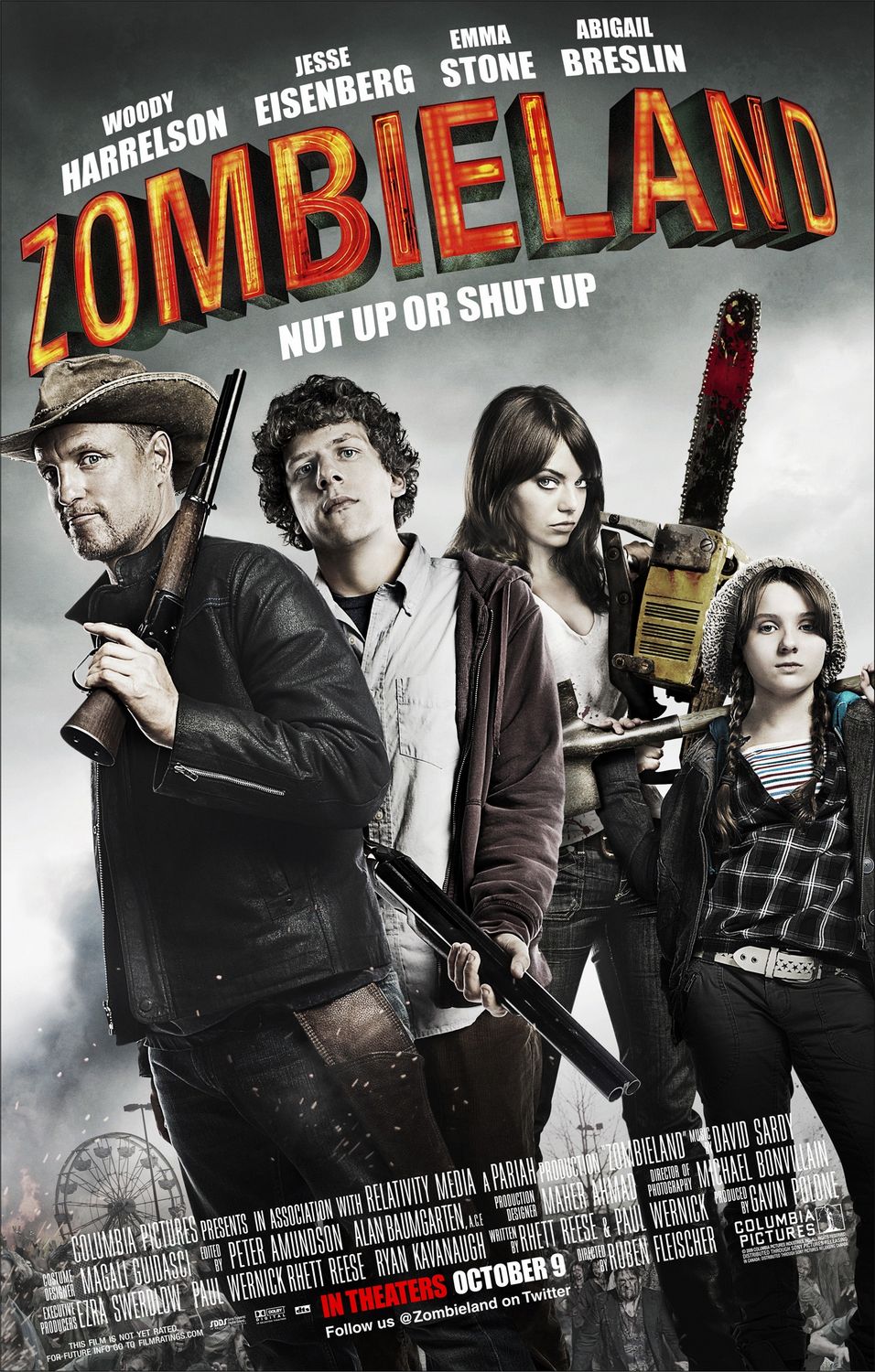
Here are some posters to help me to create my own. Need to look at the colour schemes, model positions, layouts. etc.


Sunday, 10 November 2013

Research & Planning - Actors/Actresses

During my personal time off I was thinking of some people to play as the zombies, survivors and protagonists.

I have asked a few people I know to help us out, some say they are definitely able to do it and one person says they may or may not due to them living in London for Uni and when they come home.

Gemma Davies


Jackie Goodwin

My mum kindly offered to play as a zombie and maybe perhaps a survivor. 

Here she is on the Zombie walk (2010), she managed to do the zombie make-up herself. She looked really terrifying and it made me cry, so she has also offered to teach me how to face-paint the other zombies before filming and make them look just as scary.

Samantha Goodwin

My sister has also offered to play the role as a zombie, but at the moment she is living in London for her Uni course, so we will have to see when the time comes nearer to film if she is able to film with us or not.


Thursday, 7 November 2013

Research & Planning - Zombie Eyes

 I have used Photoshop to edit my eye colour in to a Zombified version. 

Original Photo
1) First I coloured my eyes in white, then used a transparent tool to make the eye colour fade so that you can see my iris and pupil.


2) Then I outlined the iris to make it stand out by using the colour charcoal, I then slightly blended the outlined iris in with the white iris to make it look realistic and not animated.


3) Finally I removed the red pupils and painted them black, I also had to blend the pupil in with the iris to remove the harsh lines. I included the camera flashes reflection on my pupil to make my eyes look real and zombified.


Here is the edited photo.


I am going to practise more and improve my Photoshop skills for when I need to edit the eyes for the film poster and magazine shoot'.